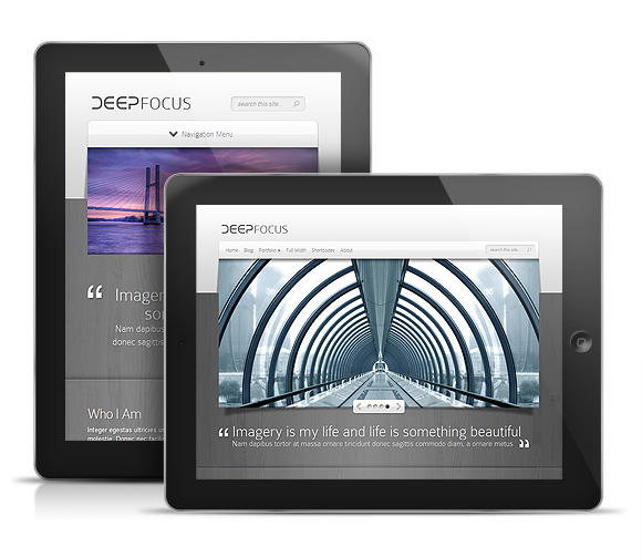
ElegantThemes today announced that their flagship photography theme Deepfocus is getting an update which includes a totally new responsive layout. Responsive design has really gained momentum over the past 6 month as can be seen by all the newly released responsive WordPress themes lately.
So if you’re new to the term Responsive Design, all you really need to understand is that Responsive themes respond to the device they are being viewed on. And by respond I mean they detect the resolution of the screen they are being viewed on and then they serve up a layout that fits that size screen accordingly. As you can see by the screenshot above of Deepfocus on the iPad, the layout in the background shrinks down to fit the vertical layout of the iPad screen when flipped. Then you can see how different the layout looks on the iPhone above that. Pretty cool huh?
Of course if most of your website visitors are visiting your site from normal web browsers on their computers at home then really they won’t notice a difference in your sites layout. Only when they go to view your site on their mobile device (iPad, iPhone, iPod, etc.) will they notice your site responding beautifully to their device.


